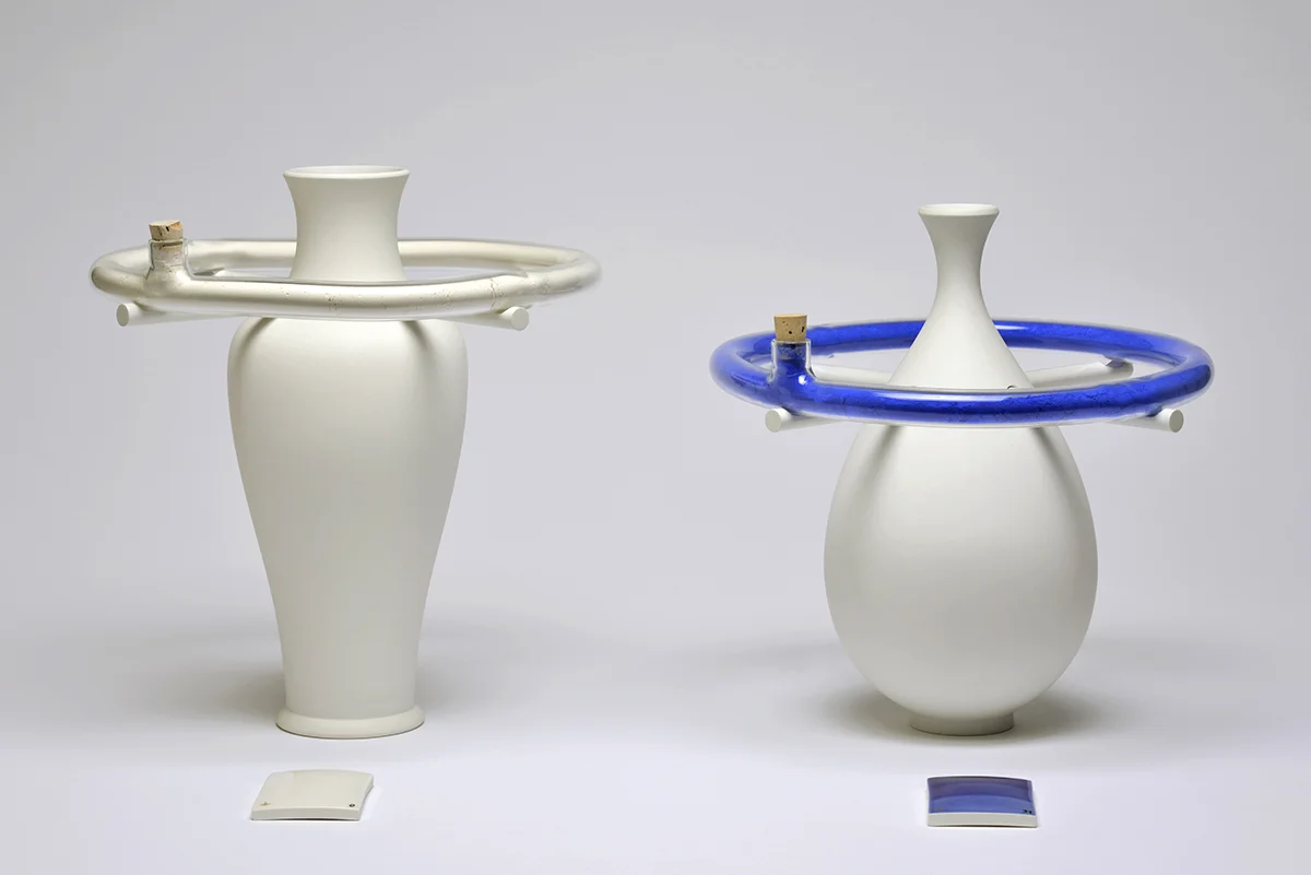
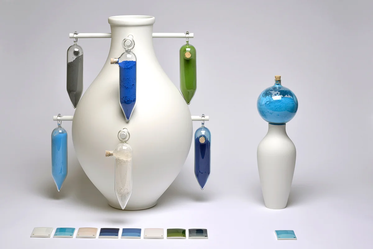
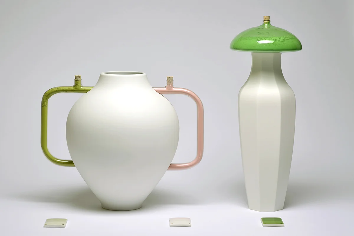
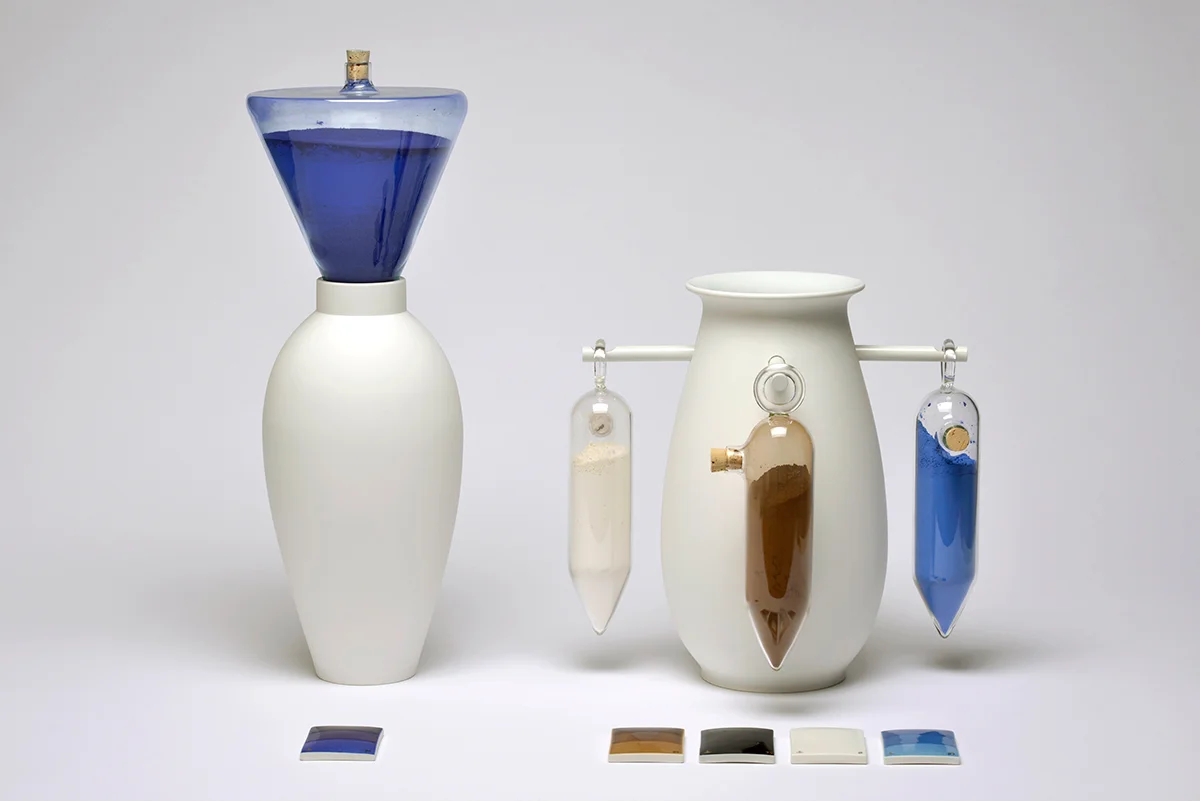
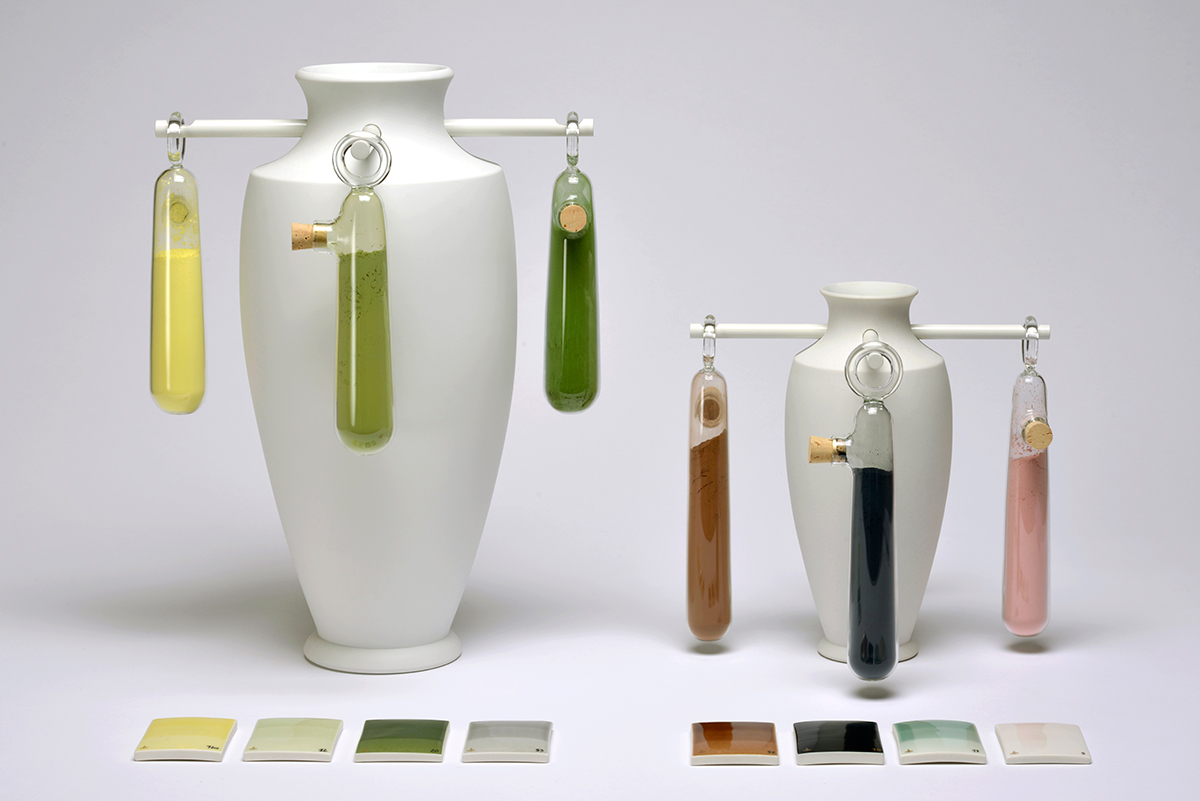
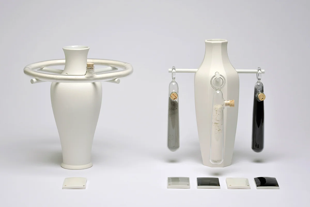
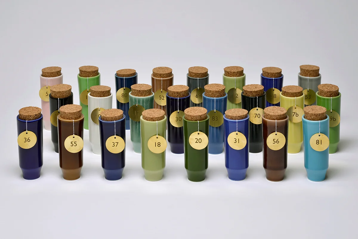
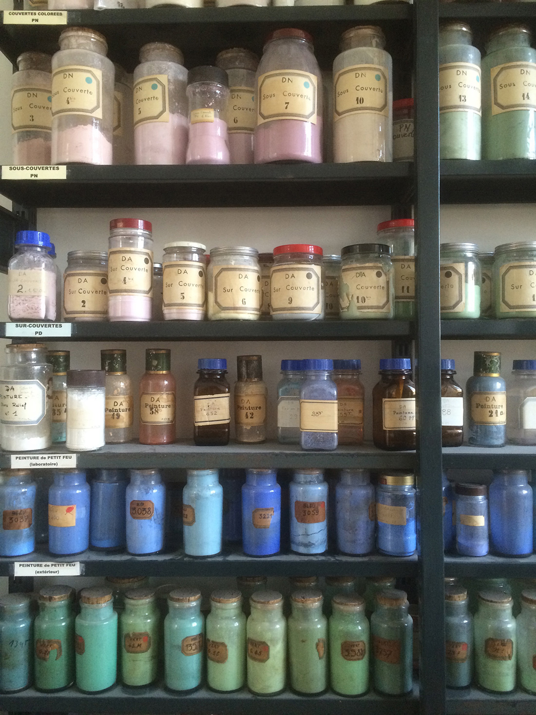
A MATTER OF COLOUR
Client: Sèvres - Cité de la Céramique
Design: Dean Brown
Photography: Gerard Jonca
Date: June 2015
A collection of 14 Vase’s consisting of porcelain, 24 colour pigments, free blown glass and powder coated aluminium. Starting by selecting classical forms from the extensive Sèvres archive, each of the 14 unglazed Vases are adorned with colour. As a celebration of “work in progress” the colour pigments, considered as the final step in the finishing of porcelain, are held in and around the uncoated vase, collected in glass containers that form handles, lids and decorative features. The viewer is encouraged to imagine the white form transformed by the colour, invited to make their own interpretation of the potential between the object and the unapplied colour.
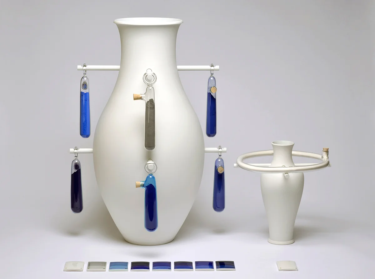
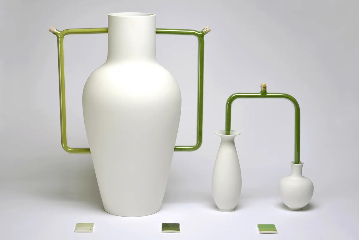
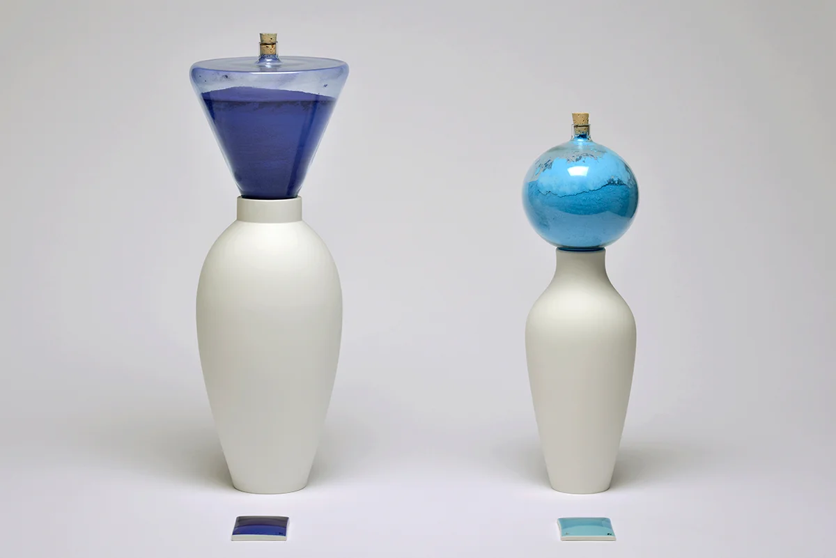


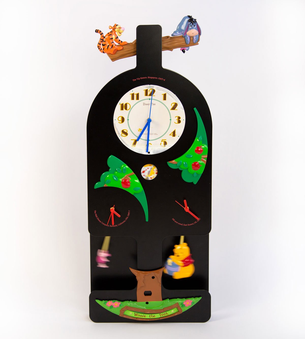
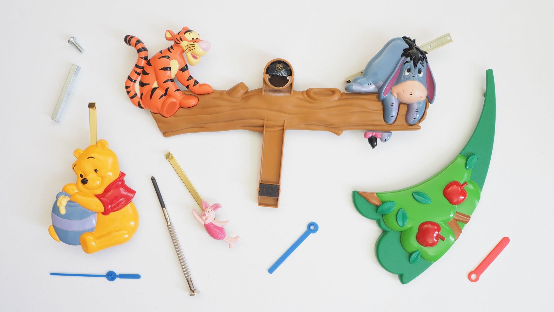
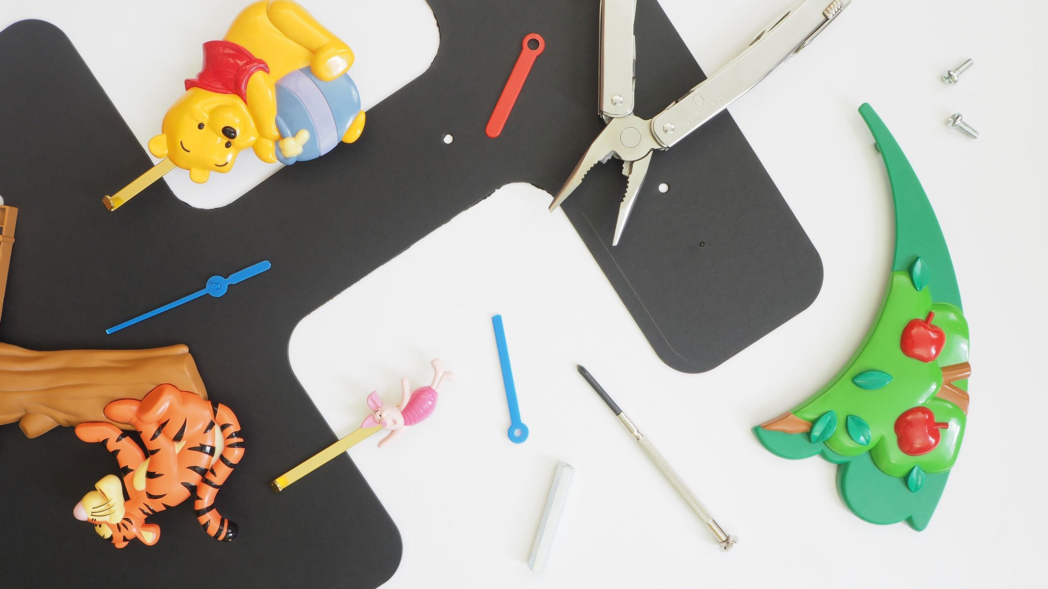
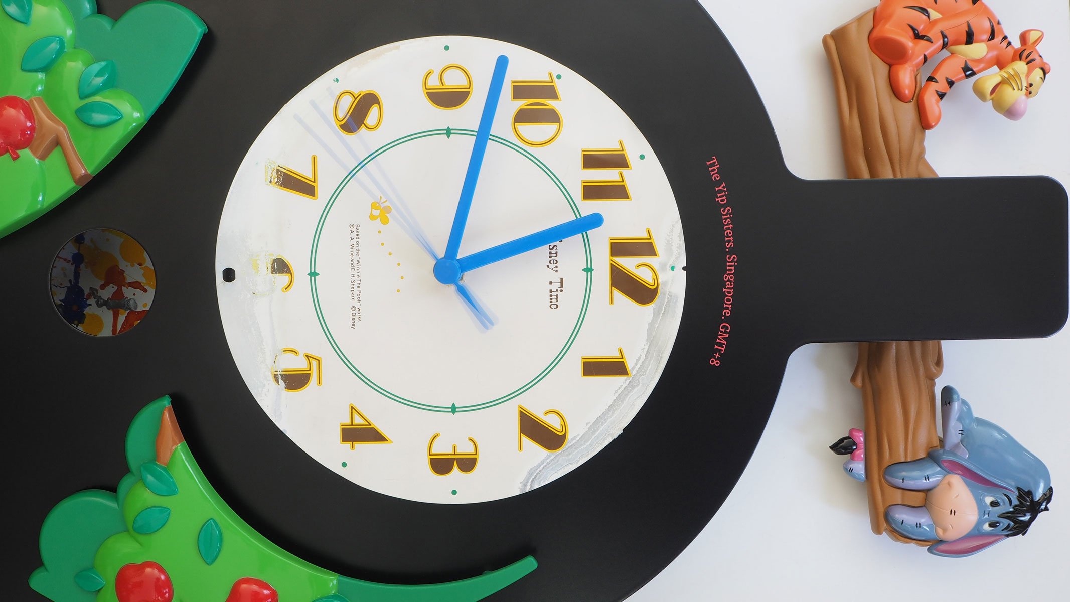
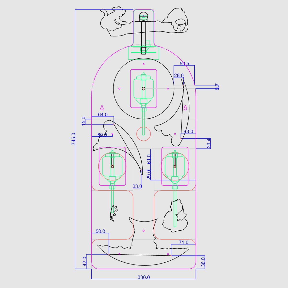
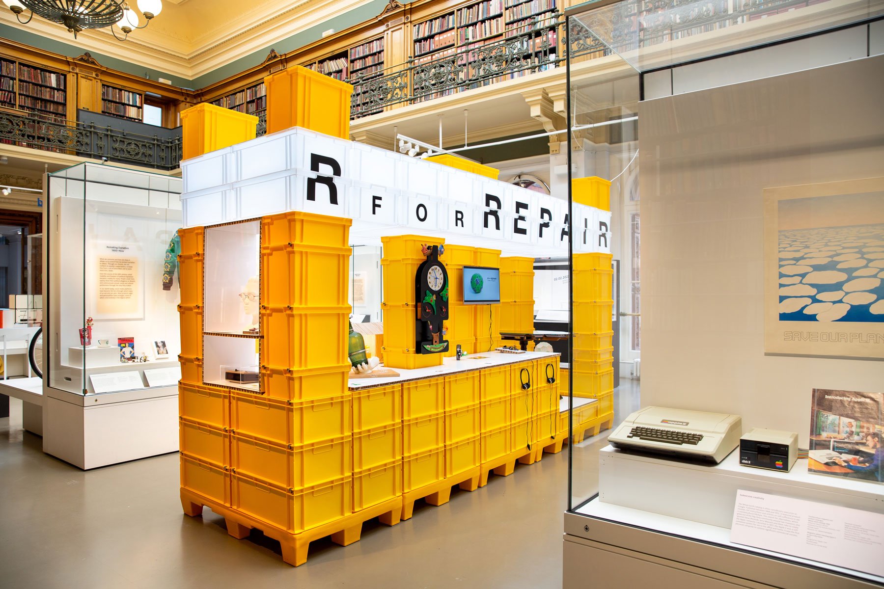
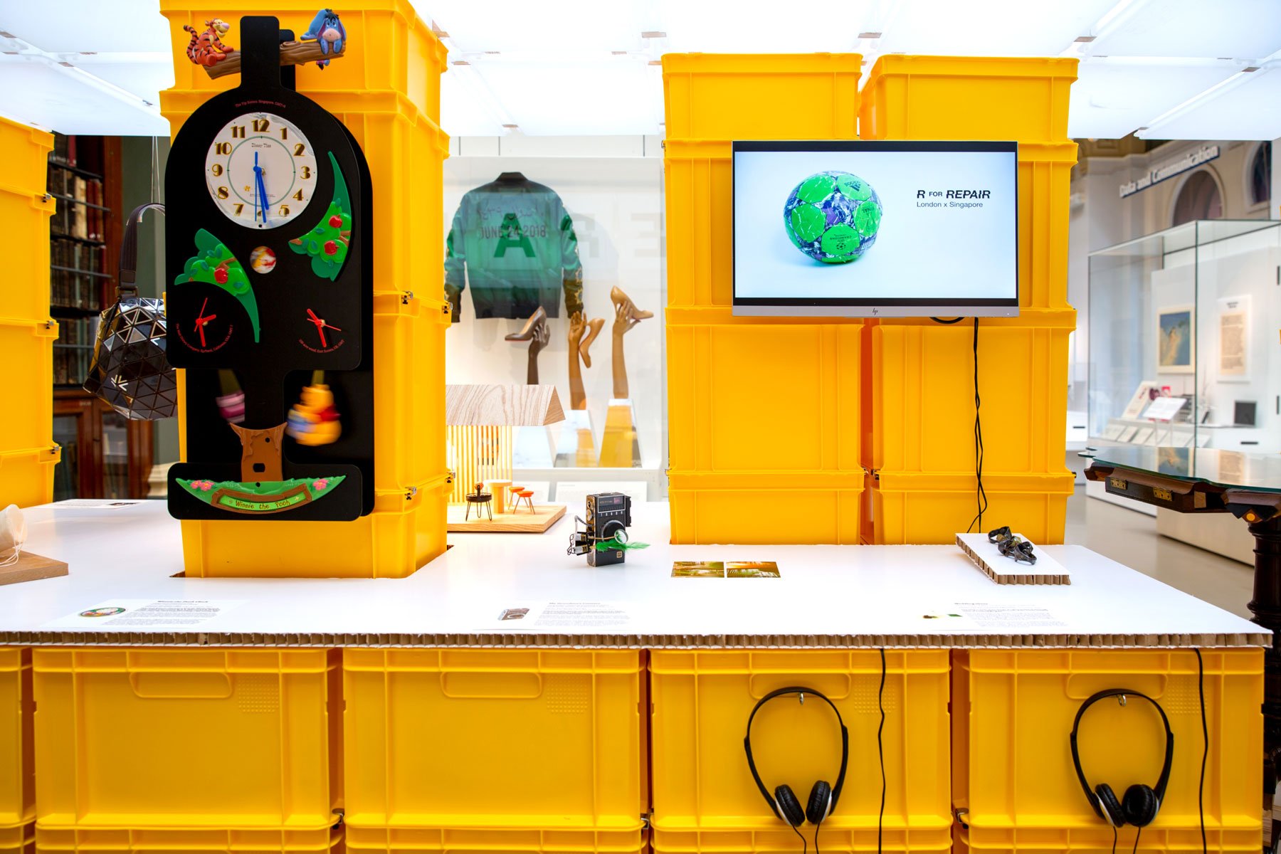
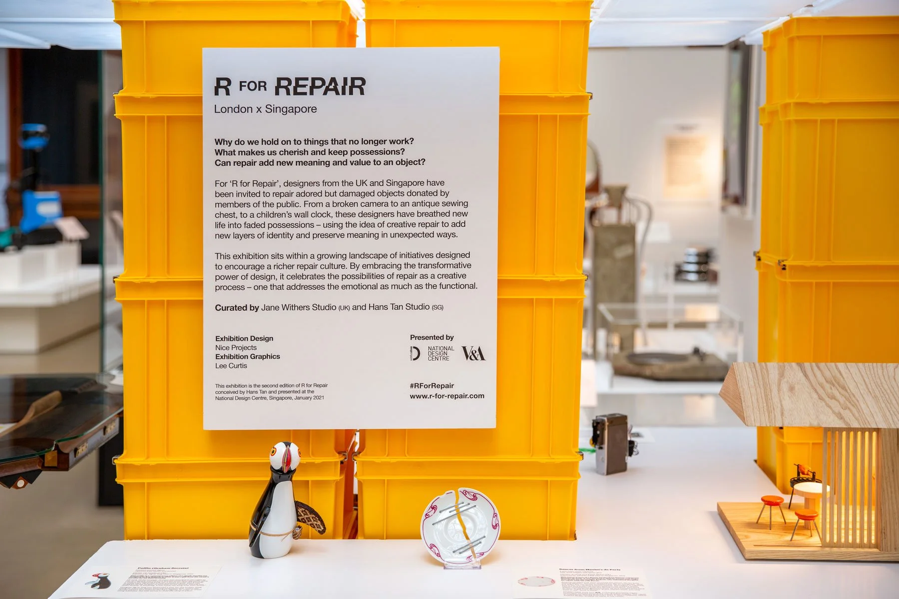
WINNIE THE POOH CLOCK
Client: R for Repair
Commissioners: Jane Withers Studio & Hans Tan
Project Partner: Design Singapore
Location: Victoria & Albert Museum
Photography: Zuketa Film Production
Exhibition Design: Nice Projects
Date: September 2022
Upon the invitation of Jane Withers Studio, Hans Tan and Design Singapore, Brown Office were invited to participate in the second edition of ‘R for Repair’ inviting designers from the UK and Singapore to repair adored but damaged objects donated by members of the public. The exhibition takes place during London Design Festival 2022 at the Victoria & Albert Museum.
Brown Office were tasked with repairing a rather charming but time-worn Winnie-the-Pooh Clock, owned by the Yip Sisters, based in Singapore. Our approach to creative repair was framed by our appreciation of the clock's international credentials.
A clock created by the Walt Disney Company, based on a British cartoon character, manufactured in China, assembled in Thailand, and presented by a Japanese businessman to the Yip Sisters in Singapore (as a family housewarming gift) can be considered a truly global artefact. As well as reinstating the clocks basic functionality our approach to creative repair was to deconstruct the product components and introduce two extra clock movements, enabling the product to not only display local time in Singapore, but also indicate related time in Burbank, California and ‘100 acre wood’ East Sussex - the home of Walt Disney and Winnie-the-Pooh respectively. In doing so we emphasised the world-wide narrative that brought this curious object into existence.
The re-design sees the clock stripped back to its essential parts and recomposed in a taller narrower ‘grandfather clock’ profile, mounted onto a powder coated aluminium panel. Such an adaptation not only makes space for two extra clock and pendulum movements - more importantly it also accentuates the products natural charm - allowing Tiger, Eeyore, Piglet and Pooh to all make some moves at the Victoria & Albert Museum and beyond.


BLUR
Client: edition van Treeck
Photography: evT
Date: October 2021
Blur takes inspiration from classical Greek vase forms. When flowers are displayed their impression is filtered and softened when viewed through the coloured glass. The series is also a blurring of the historical and contemporary - reinterpreting the classic Amphora, Psykter and Kylix archetypes. Here the most essential features, the body and foot, are retained whilst the neck, handle and lip are removed. This simplification creates a bolder geometric presence, derived from a folded steel foot component that holds a glass body silhouette and cylindrical flower holder. At the core of the concept is the question of how to redefine classical form through the cutting, folding and assembly of primarily flat materials. Overall the Blur series is aligned with the ethos and craftsmanship of edition van Treeck as a contemporary approach to glassware with a nod to the historical.

VILLA NECCHI
Client: FAI
Design: Fabrica Design Team
Date: April 2012
A site specific collection by Fabrica Design Department for Villa Necchi - a 1930’s Villa in the heart of Milan. Using the historical inhabitants and the Portaluppi architecture as a point of inspiration the team created 23 unique objects to feature in every room of the house. These items were proposed as a contemporary counterpart to the vintage interior, interpreting details of the villa, and its three inhabitants as an artistic muse.

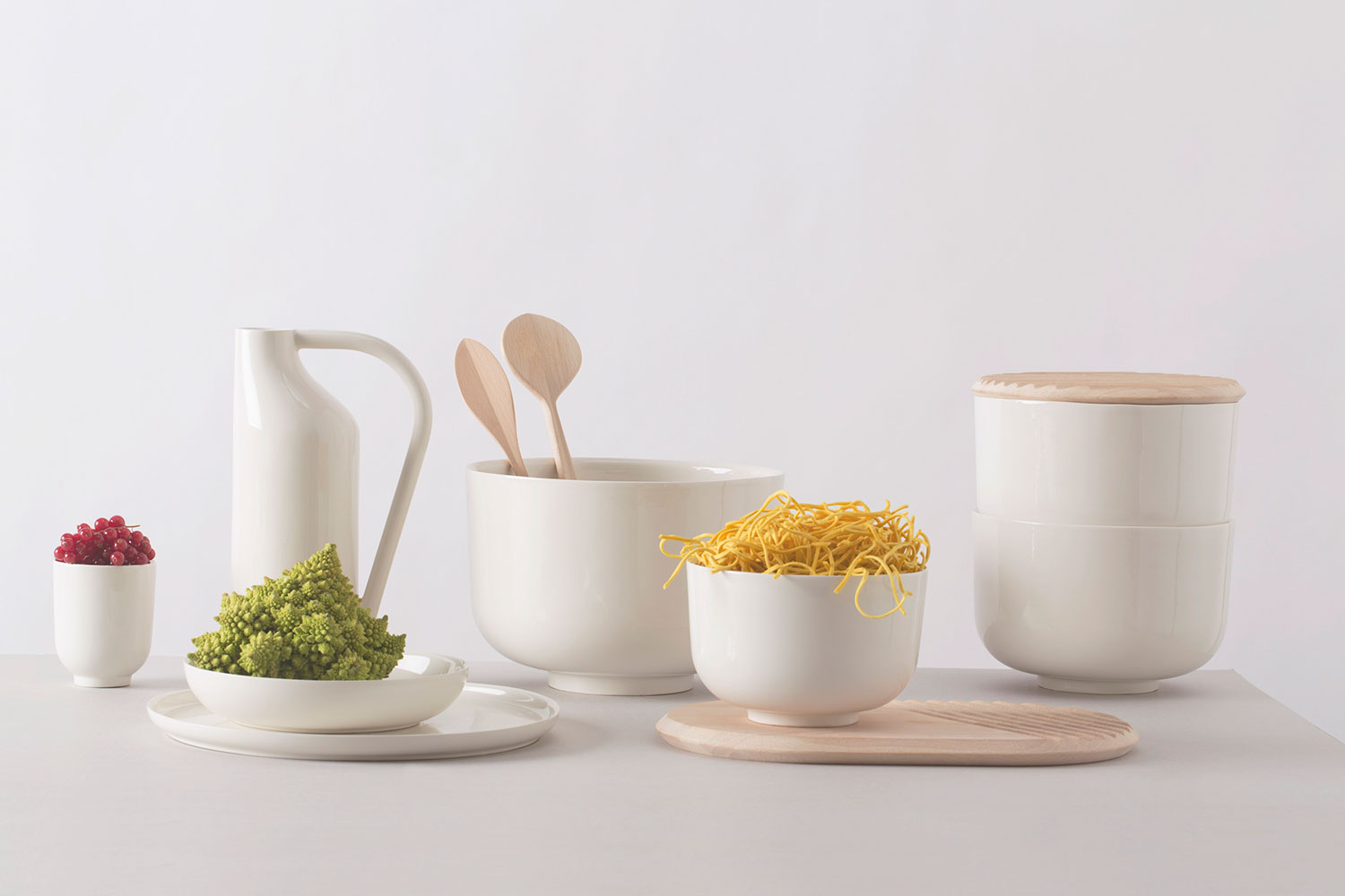
A TABLE
Client: Atipico
Design: Fabrica Design Team
Photography: Marco Zanin (Fabrica)
Date: January 2015
Link: A Table
Atipico collaborates with Fabrica to design À TABLE, a tableware collection that celebrates the collective dining habits spanning a diversity of countries worldwide. The result is an eclectic collection that represents the craft qualities associated with “Made in Italy” enriched by global touch points brought by Fabrica’s international design team. Eleven countries were considered and analyzed for the collection: China, Egypt, England, Finland, France, Germany, India, Italy, Japan, Morocco and Scotland.

MAKESHIFT TRAY
Design: Dean Brown (Fabrica)
Photography: Marco Zanin (Fabrica)
Date: November 2014
Link: L'ArcoBaleno
The distinctiveness of this object is the bringing together of the artisanal and the industrial, juxtaposing folded sheet aluminium and hand carved wood. Its use-fullness is somewhere between a tray and a box for holding most things and to be comfortably held.
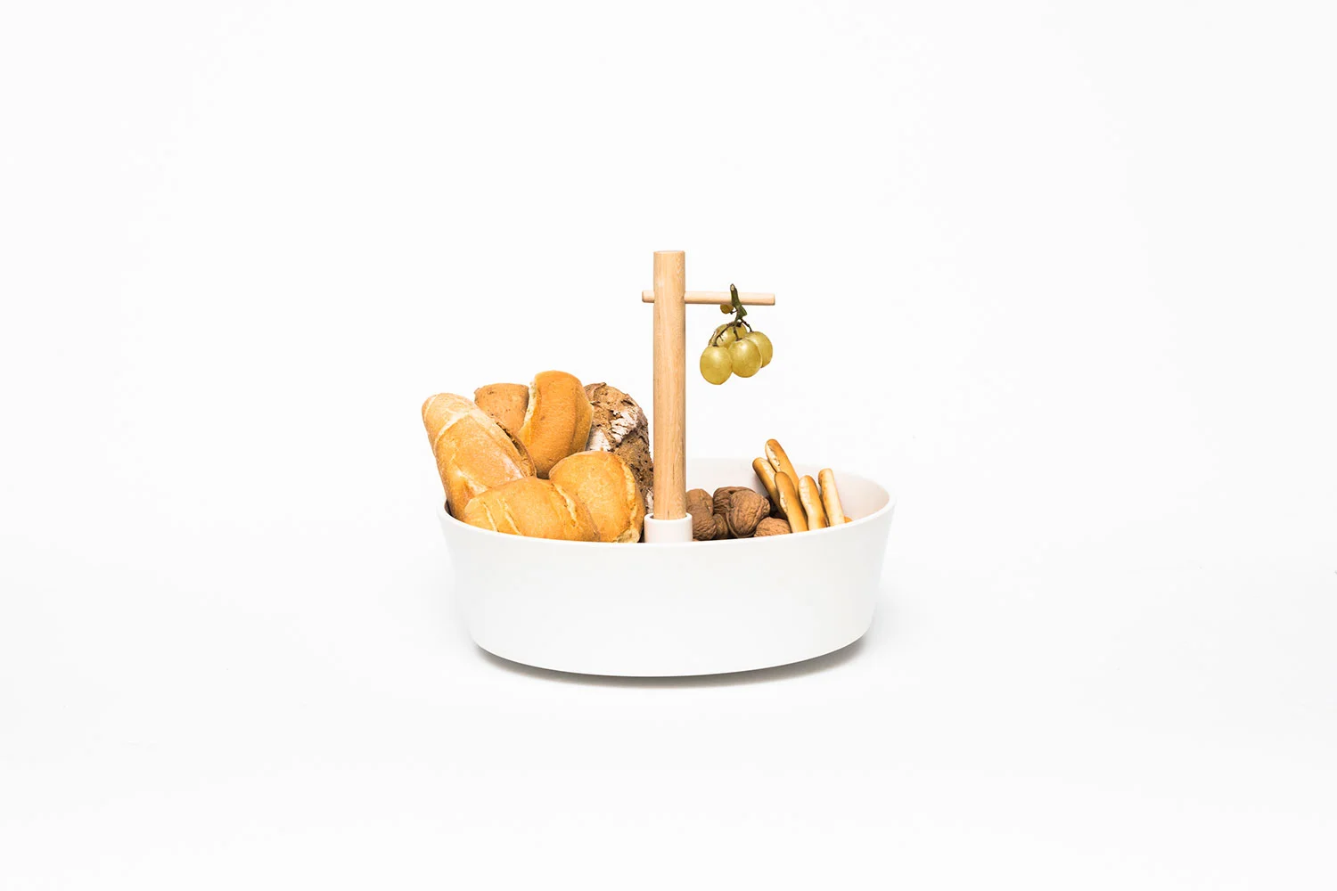
DILEMMA
Design: Dean Brown (Fabrica)
Photography: Shek Po Kwan
Date: January 2014
An uncertain table piece that can be used as fruit bowl or a cake plate. It acknowledges a personal dilemma: to eat healthily or to indulge. Without being judgmental, it presents two alternative ways to enjoy food.
HOW TO USE
1. Fruit bowl assembly – mount the ceramic piece (bowl side up) on the wooden stick with the wooden platform at the base. Insert the wooden peg in the hole to hang bananas, grapes etc.
2. Cake plate assembly – mount the ceramic piece (flat side up) on the wooden stick with the wooden platform at the base. Fix the extra wooden platform on top of the stick.

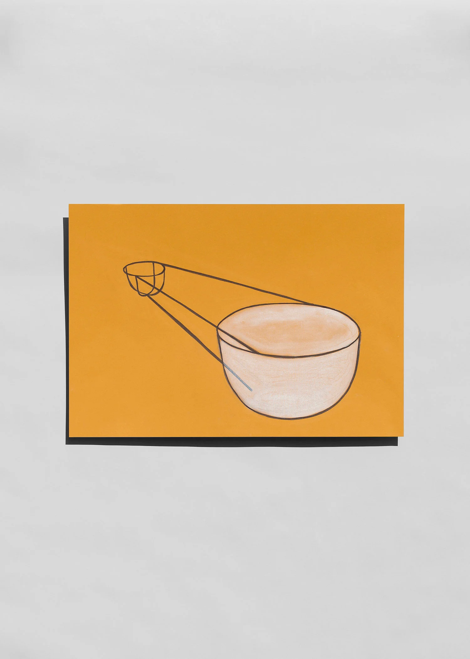
MEASUREMENTS
Design: Dean Brown (Fabrica)
Photography: Marco Zanin
Date: September 2013
The codes and conventions of technical drawing are embedded into the glass itself - represented as annotated dimension lines that convey height and diameter. The statement is ironic, considering the drawings are made 1:1 scale, and the dimension lines are dissociated with their numerical values.
The piece is part of the ‘Drawing Glass’ series - a collaboration between Fabrica Design team and the master glass blower Massimo Lunardon. Here conventional manufacturing drawings are dismissed in favour of creating expressive 1:1 sketches. In doing so it reframes the relationship between between designer and maker, establishing a more ambiguous and free dialogue akin to a co-authorship.
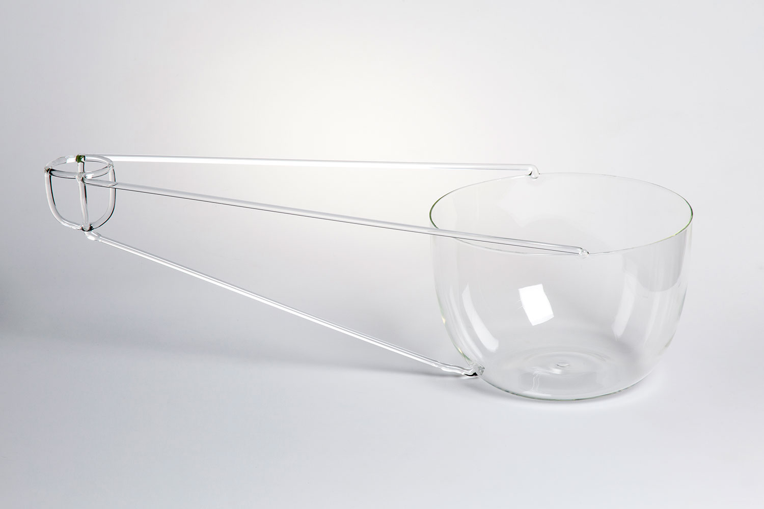
PERSPECTIVE
Design: Dean Brown (Fabrica)
Photography: Marco Zanin
Date: September 2013
Adopting the principle of single point perspective drawing, two spherical containers are physically and conceptuality joined. They are "empty" and "full" versions of each other, contrasting in scale and materiality.
The piece is part of the ‘Drawing Glass’ series - a collaboration between Fabrica Design team and the master glass blower Massimo Lunardon. Here conventional manufacturing drawings are dismissed in favour of creating expressive 1:1 sketches. In doing so it reframes the relationship between between designer and maker, establishing a more ambiguous and free dialogue akin to a co-authorship.

PLATE LIFE
Client: &Foam
Design: Dean Brown (Fabrica)
Photography: Alberto Ferretto
Date: July 2012
Plate Life - a domestic still life drawing inspiration from the fundamental principles of photography, composed of a frame, a subject and a light source. The piece draws comparison between a photographic umbrella & the everyday dish rack, positioning two ceramic bowls and a light-source in a state of interdependency - the larger silvered plate directing the light source back upon itself. Plate Life is part of the ‘Still Lights’ collection, by Fabrica Design Department for &Foam photography gallery in Amsterdam.

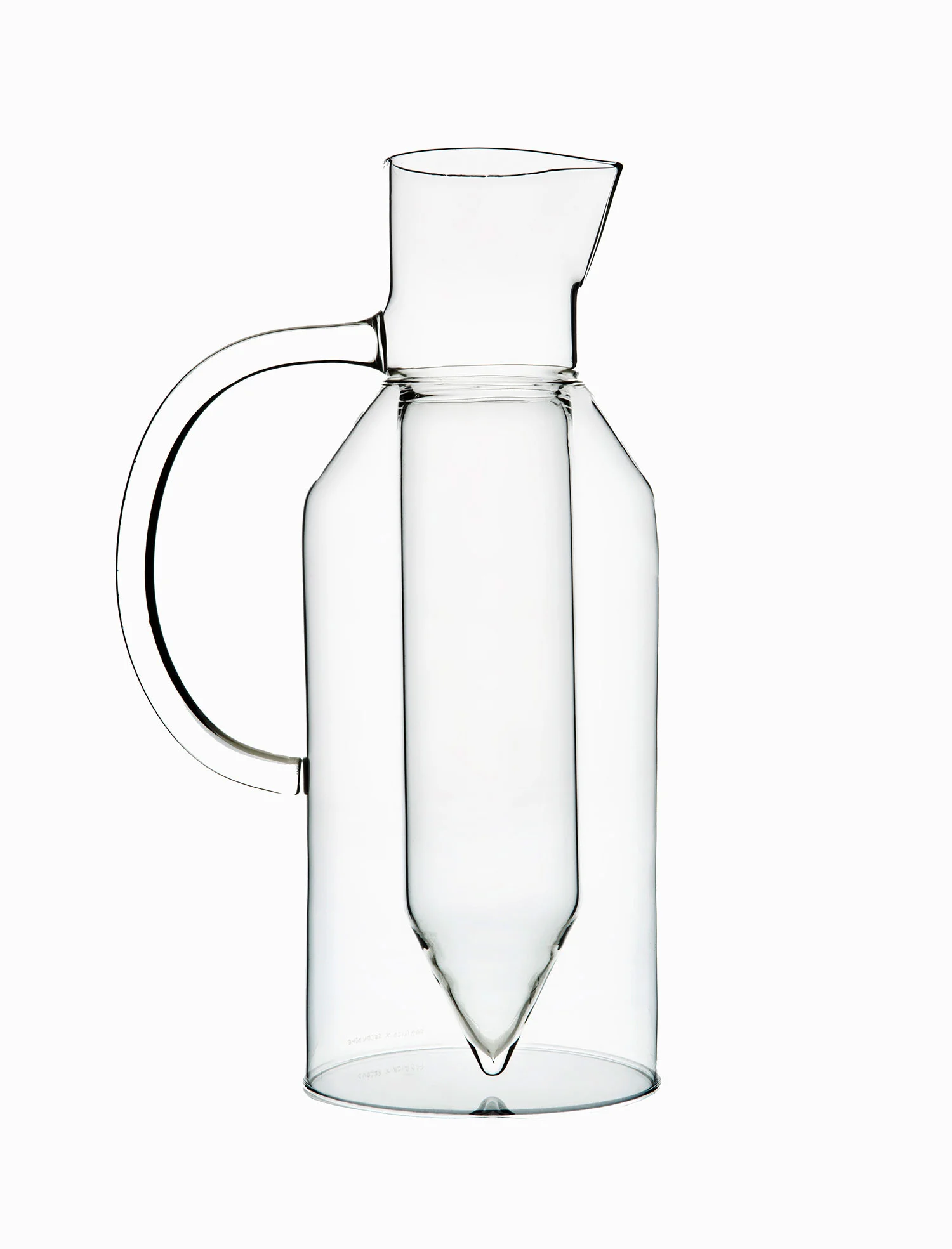
UPLIFTING CARAFES
Client: Secondome
Design: Dean Brown (Fabrica)
Date: April 2012
The ritual of drinking together is synonymous with lifting the spirits. The contents of the carafes - Chianti, Prosecco, balsamic vinegar and olive oil - are at the centre of the concept elevated in height and status, whilst the transparency of the glass fades into the setting. The impression is of a levitating liquid, raised above the surface of the table, celebrated and for celebrating.

COMPLEMENTARIES
Client: Secondome
Design: Dean Brown (Fabrica)
Photography: Gustavo Millon
Date: April 2011
For Secondome Gallery, Salone del Mobile 2011 Collection . An arrangement of interdependent oak wood panels and glass pipes. Each element has a particular property, reliant on the other to be complete. Together the parts support each other structurally and aesthetically - adopting a slender, poised position, ready to hold and highlight its contents. The language is derived from irrigation systems, based on the principle of sharing resources underneath the surface.

SHARED BASE FAMILY
Client: Secondome
Design: Dean Brown (Fabrica)
Photography: Gustavo Millon
Date: September 2010
A Vase, a Fruit Bowl and a Cake Plate, all with a sense of hierarchy between above and below. The glassware collection strived for a visual tension between sameness and individuality, expressed through a common base form and variations of transparent, green and ribbed borosilicate glass.

TRANSIT VASES
Design: Dean Brown
Date: September 2016
Inspired by how wine bottles are packaged and transported, the collection of 4 Vases uses the wooden packaging box as an integral part of it’s design and movability. Made in Italy and exhibited for the first time in London, the logistics of delivery from country to country informed the design concept, becoming an explicit and endearing challenge - designing Vases with transport in mind.
Fashioned in oak, leather, brass and free blown borosilicate glass, the four objects explore the fusion of a box and a vase - enabling new compositions that introduce a clock and a table top as useful travel companions.
A Matter of Colour, Sevres
Winnie the Pooh Clock, R for Repair
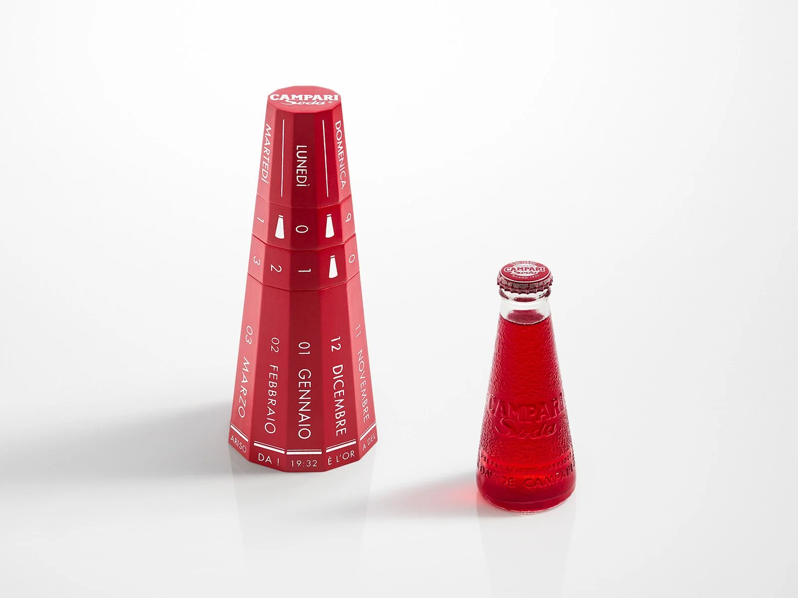
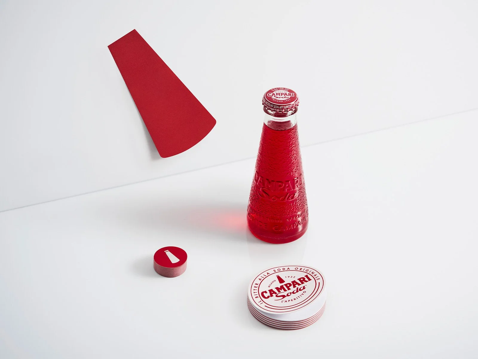
Fabrica x Campari Soda
Blur, edition van Treeck
Villa Necchi, Fabrica x Nodus
A Table, Atipico
Makeshift Tray, L’ArcoBaleno
Dilemma, Fabrica
Drawing Glass, Fabrica
Plate Life, Secondome
Uplifting Carafes, Secondome
Complementaries, Secondome
Shared Base Family, Secondome
Transit Vases